2020
4(64)
DOI: 10.37190/arc200402
Wprowadzenie
Tematem artykułu jest analiza koloru w architekturze
Bauhausu w oparciu o rozmyślania Wassilego Kandin-
skiego ujęte w książce O duchowości w sztuce [1], a także
przeniesienie zagadnienia na architekturę współczesną
w oparciu o analizę abstrakcyjnej kompozycji malarskiej.
Intencją autora jest zwrócenie uwagi na aspekt barwy/ko-
loru w obecnie realizowanych obiektach. Przyczynkiem
natomiast – poczucie będące wynikiem obserwacji, dają-
ce przeświadczenie o lekceważeniu roli koloru we współ-
czesnej architekturze.
Bauhaus
Kolor jest klawiszem. Oko jest młoteczkiem. Duch zaś
wielostrunnym fortepianem
[1, s. 62]. Przytoczony frag-
ment tekstu pokazuje, jak istotne miejsce w hierarchii
elementów składających się na całościowy odbiór dzieła
plastycznego w oczach Wassilego Kandinskiego zajmuje
kolor
1
. Te trzy krótkie zdania, będąc częścią znacznie ob-
szerniejszego opracowania poświęconego „duchowości”
* ORCID: 0000-0003-2710-403X. Wydział Architektury Politech-
niki Warszawskiej / Faculty of Architecture, Warsaw University of Tech-
nology, e-mail: radoslaw.balcerzak@pw.edu.pl
1
W tekście posługuję się rozróżnieniem pojęć „kolor” i „barwa”
wedle rozumienia ich bliższego praktykom używającym w pracy „kolo-
ru” i „barwy” w formie pigmentu. „Kolor” określa barwy chromatyczne.
Natomiast „barwa” jest pojęciem szerszym, zawierającym w sobie opis
barw chromatycznych i achromatycznych.
Radosław Balcerzak*
Kolory przeciwstawne w teorii barw W. Kandinskiego
jako element architektury współczesnej
Contrasting colors in W. Kandinsky’s theory of colors
as an element of contemporary architecture
Introduction
The subject of this article is the analysis of color in
Bauhaus architecture on the basis of Wassily Kandinsky’s
reections included in the book Concerning the Spiritual
in Art [1] as well as the transition of the issue to contem-
porary architecture based on the analysis of an abstract
painting composition. The intention of the author is to
draw attention to the aspect of color/hue in the currently
implemented objects. However, the reason is the feeling
resulting from observation, which gives the belief that the
role of color in contemporary architecture is neglected.
Bauhaus
Color is the keyboard. The eye is the hammer. The soul
is the piano, with its many strings [1, p. 62]. The fragment
of the text quoted above shows the importance of color in
the hierarchy of elements that make up the overall percep-
tion of an artistic work in the eyes of Wassily Kandinsky
1
.
These three short sentences, being part of a much more
extensive study devoted to “spiritual” in art, seeming-
ly distant from the material foundations of architecture,
describe a very important role of color in an extremely
synthetic manner. They acknowledge that the color used
1
In the text, I am using a distinction between the terms “color”
and “hue” as understood by practicians who use “color” and “hue” in the
form of a pigment. “Color” describes the chromatic colors. On the other
hand, “hue” is a broader concept that includes a description of chromatic
and achromatic colors.
16 Radosław Balcerzak
w sztuce, na pozór odległej materialnym podstawom ar-
chitektury, w niezwykle syntetyczny sposób opisują nader
istotną rolę barwy. Zauważają, że użyty kolor wywołuje
u odbiorcy określone wrażenie. Tym samym oznacza, że
świadome zastosowanie barwy daje możliwość zbudowa-
nia lub wzmocnienia oczekiwanych doznań. Pozwala na
kreowanie znacznie silniejszego przekazu, dając również
narzędzie o bardzo szerokim zakresie oddziaływania.
Bauhaus od początku swojej działalności zauważał
problem barwy w architekturze. Potwierdzeniem jest fakt,
iż wśród wykładającej na tej uczelni kadry pojawiali się
wybitni artyści, tacy jak Paul Klee, Wassily Kandinsky
czy Johannes Itten. Kolorem zajmowali się również ar-
chitekci, teoretycy koloru oraz praktycy zagadnień barw-
nych, z których wymienić trzeba Josefa Albersa. Trzej
ostatni zapisali się jako autorzy szukający jakże trudnego,
jeżeli w ogóle możliwego do zdeniowania, klucza do
praktycznego używania barw w określonych kongura-
cjach. Kandinsky wydał dwie pozycje pod tytułami: Punkt
i linia a płaszczyzna. Przyczynek do analizy elementów
malarskich [2] oraz O duchowości w sztuce [1]. Johannes
Itten zdobyte doświadczenia przedstawił w książce Sztuka
barwy [3]. Natomiast Josef Albers w pracy pod tytułem
Interaction of colours [4] w nowatorski jak na ówczesne
czasy sposób zwracał uwagę na znaczenie praktycznego
przygotowania w nauce o kolorze przed poznaniem teorii.
Paul Klee również pozostawił w swojej spuściźnie teksty
traktujące o sztuce w formie artykułów oraz spisanych
wykładów.
W tym świetle zastanawiać może automatyczne bardzo
często kojarzenie architektury modernizmu z brakiem
koloru, z przewagą bieli i szarości o różnym nasyceniu.
Wskazywanymi przyczynami przytoczonego rozumienia
twórczości architektów wywodzących się stylistycznie
z Bauhausu może być dominująca do stosunkowo nie-
odległych czasów forma wizualnego przekazu oparta na
czarno-białym druku [5]. Niebagatelnym powodem mo-
gło być również dążenie przez samych autorów do jak
najszerszej dostępności proponowanych rozwiązań archi-
tektonicznych, co wiązało się również z nansami. Wy-
raziste i trwałe kolory nawet po wprowadzeniu masowej
produkcji opartej na syntetycznych składnikach zazwy-
czaj generowały większe koszty. Jednakże stała obecność
w szkole pedagogów specjalizujących się w nauce koloru
oraz wiele realizacji budynków i całych kompleksów za-
budowań – za których projektami stali architekci z uczel-
ni, nieunikający odważnych zestawień barwnych – wska-
zywać może na potrzebę skierowania uwagi na kolor [6].
Kandinsky w swoich tekstach nader często porusza się
w niezwykle obszernej i trudnej do określenia sferze przy-
pisanej działaniom wynikającym z potrzeb czysto ducho-
wych, a nawet noszących znamiona boskich interwencji,
określając je mianem „wewnętrznej konieczności”: […]
działanie wewnętrznej konieczności, a tym samym rozwój
sztuki jest stałym uzewnętrznieniem się odwiecznie obiek-
tywnego w czasowym i subiektywnym [1, s. 80]. Omawia-
jąc kwestię koloru, posługuje się parami barw tworzących
przeciwieństwa w energii, kolorze (w przypadku pary
biel–czerń w nasyceniu) oraz w temperaturze. Zapropono-
wał własne koło barw zawierające sześć kolorów (podsta-
creates a specic impression on the recipient. Thus, it
means that the conscious use of color gives the oppor-
tunity to build or strengthen the expected experiences. It
allows you to create a much stronger message, also giving
you a tool with a very wide range of impact.
Bauhaus noticed the problem of color in architecture
from the very beginning. This is conrmed by the fact that
eminent artists such as Paul Klee, Wassily Kandinsky and
Johannes Itten appeared among the teaching sta at that
university. Color was also dealt with by architects, color
theorists and practitioners of color issues, among whom
we should mention Josef Albers. The latter three went
down in history as authors looking for a dicult, if at all
possible to dene, key to the practical use of colors in spe-
cic congurations. Kandinsky published two books enti-
tled: Point and Line to Plane. Contribution to the Analysis
of the Pictorial Elements [2] and Concerning the Spiritual
in Art [1]. Johannes Itten presented his experiences in the
book The Art of Color [3]. On the other hand, Josef Albers,
in his work entitled Interaction of color [4], in an innova-
tive way for his time, drew attention to the importance of
practical preparation in the science of color before getting
to know the theory. In his legacy, Paul Klee also left texts
on art in the form of articles and written lectures.
In the light of the above, the automatic association of
modernist architecture with the lack of color, with the
predominance of white and gray of varying saturation,
may be puzzling. The reasons indicated for the cited un-
derstanding of the work of architects, who stylistically
derived from the Bauhaus, may result from the form of
visual message based on black and white print, which
was dominant until relatively recent times [5]. A con-
siderable reason could also the authors’ striving for the
widest possible availability of the proposed architectural
solutions, which was also associated with nances. Ex-
pressive and durable colors, even after the introduction of
mass production based on synthetic ingredients, usually
generated higher costs. However, the constant presence
of educators specializing in color science at school and
many implementations of buildings as well as entire com-
plexes of buildings – designs of which were elaborated
by architects from the university, who did not avoid bold
color combinations – may indicate the need to focus on
color [6].
In his texts, Kandinsky very often deals with an ex-
tremely broad and dicult to dene sphere assigned to
activities resulting from purely spiritual needs, and even
bearing the hallmarks of divine interventions, describing
them as “inner necessity”: [...] the working of the inner
necessity and, therefore, the development of art is an ever
advancing expression of the eternally objective the tem-
porary subjective [1, p. 80]. When discussing the issue
of color, he uses pairs of colors that create opposites in
energy, color (in the case of black and white in saturation)
and temperature. He proposed his own circle of colors
containing six colors (primary and derivative), diering
from a widely recognized change in two out of the three
complementary color pairs. He juxtaposed yellow with
blue and orange with violet. On the basis of the experience
and the analysis of colors resulting from the relationship

Kolory przeciwstawne w teorii barw W. Kandinskiego / Contrasting colors in W. Kandinsky’s theory of colors 17
wowe i pochodne), różniące się od powszechnie uznane-
go zmianą w dwóch z trzech par kolorów dopełniających.
Żółć zestawił z błękitem a pomarańczowy z oletem.
Opierając się na doświadczeniu oraz analizie kolorów bę-
dących wynikiem relacji między powierzchnią oświetloną
i powierzchnią ocienioną, gdy źródło światła ma wyraźne
zabarwienie, można zaryzykować stwierdzenie, że zapro-
ponowana modykacja w zasadzie nie reorientuje zrozu-
miałego „uproszczenia” w kole barw, którego kolorami
dopełniającymi są pary: żółć–olet, błękit–pomarańczo-
wy oraz czerwień–zieleń. Opisując konkretne barwy, au-
tor sugestywnie i bardzo realistycznie odniósł się do zwią-
zanych z nimi doznań: Biel jest tak wysoko ponad nami, że
nie dochodzi już stamtąd żaden głos, tchnie wielką ciszą
[1, s. 92]. Denicja bieli wprowadzić może w konsterna-
cję. Czy tak ujmowana barwa może mieć coś wspólne-
go z architekturą? Kolejny cytat przynajmniej częściowo
powinien rozwiać wątpliwości. Nie da się zaprzeczyć, że
ścisły związek pomiędzy kolorem a formą zmusza nas do
analizy wpływu, jaki kształt wywiera na kolor [1, s. 65].
Oczywiście można się spierać, czy większy wpływ wy-
wiera kolor na formę czy forma na kolor, uznając rzecz
jasna, że opisane relacje w ogóle zachodzą. Jeżeli zgodzi-
my się, że mają miejsce, a podstawą takiego myślenia jest
budowanie kompozycji malarskich, uznać winniśmy, że
Kandinsky, używając nawet bardzo swobodnych słów do
tworzenia denicji poszczególnych barw, odnosił je rów-
nież do projektów architektonicznych. Fizyczne budynki
widział zapewne jako kompozycje malarskie rządzące się
dążeniem do harmonii
2
. Przyjmując powyższe stwierdze-
nie, spirytualne przemyślenia autora na temat kompozycji
obrazu, jego elementów oraz barw należy uznać za czy-
telną wskazówkę dla architekta dążącego do połączenia
w swoich realizacjach sztuk pięknych.
Przytoczony cytat charakteryzujący biel nie pojawił się
przypadkowo. Z malarskiego punktu widzenia projekt bu-
dynku mającego powstać w rzeczywistości, stworzonego
za pomocą barw achromatycznych
3
, jest czystą abstrak-
cją [7], [8]. Zarówno światło naturalne (dominująca jego
część), jak i większość używanych źródeł światła sztucz-
nego ma zabarwienie. Efektem zderzenia barwy achroma-
tycznej na bryle ze światłem posiadającym kolor jest bar-
dzo wyraźne wprowadzenie koloru na płaszczyzny, które
w projekcie opierały się jedynie na skali szarości. W re-
zultacie dom, szkoła, muzeum (zaprojektowane w skali
achromatycznej szarości) – które za Kandinskim opisać
moglibyśmy jako nieruchome, pozbawione życia i energii
(tak Kandinsky opisywał szarość) – przyjmują atrybuty
przynależne zupełnie innym barwom. Zyskują – w myśl
określeń często używanych przez Kandinskiego w stosun-
ku do barw – na witalności, energii. Stają się zimne i nie-
przystępne, innym razem radosne i pełne słońca. Można
uznać, że to nieistotny szczegół. Jeżeli jednak przyjrzymy
się wybitnym dziełom malarskim, bez wątpienia zgodzi-
2
W dużym uproszczeniu, w czasach gdy tworzył Kandinsky, sztu-
ki plastyczne wyzwalały się z obowiązujących kanonów. Jednak nadal
w swoich realizacjach dążyły do ukazania piękna i harmonii.
3
Barwy achromatyczne: biel, skala szarości od bieli do czerni,
czerń.
between the illuminated surface and the shaded surface,
when the light source has a distinct color, one can risk
a statement that the proposed modication does not, in
principle, reorient an understandable “simplication” in
the color circle, whose complementary colors are the fol-
lowing pairs: yellow–violet, blue–orange and red–green.
Describing specic colors, the author suggestively and
very realistically referred to the associated experiences:
White is a symbol of a world from which all colour, as
a material quality and substance, has dissappeared. This
world is so far above us that we cannot perceive any
sound coming from it [1, p. 92]. The denition of white
can be confusing. Can the color dened in this way have
anything to do with architecture? The next quote should
at least partially clear the doubts. This unavoidable in-
uence and mutual relation between form and colour
causes us to observe the eect, which form has on colour
[1, p. 65]. Obviously, one can argue whether color has
a greater inuence on form or form on color, recognizing,
of course, that the described relations take place at all. If
we agree that they do take place and the basis for such
thinking is the performance of painting compositions, we
should conclude that Kandinsky, even when using very
free words to create denitions of individual colors, also
applied them to architectural designs. He probably saw
physical buildings as painting compositions governed by
the aspiration for harmony
2
. Assuming the above state-
ment, the author’s spiritual thoughts on the composition
of a painting, its elements and colors should be considered
a clear indication for an architect who wants to combine
ne arts in his works.
The above quotation describing white color did not
appear by accident. From the painter’s point of view, the
design of a building that is to be created in reality with
the use of achromatic colors
3
is pure abstraction [7], [8].
Both natural light (its dominant part) and most of the used
articial light sources are colored. The eect of the col-
lision of the achromatic color on the block with the light
having color is a very clear introduction of color on the
surfaces, which in the design were based only on the scale
of gray. As a result, the house, the school, the museum (de-
signed in an achromatic scale of gray) – which, following
Kandinsky, we could describe as immobile, void of any
power and resistance (this is how Kandinsky described
gray) – take on attributes belonging to completely dierent
colors. They gain – according to the terms often used by
Kandinsky in relation to colors – on vitality and energy.
They become cold and inaccessible, and then in turn joyful
and full of sunshine. This can be considered an insigni-
cant detail. However, if we look at outstanding paintings,
we will undoubtedly agree that regardless of the subject,
style and expression of a given painting, thanks to the nu-
ances that make up the composition, we call these works
masterpieces.
2
To put it simply, at the time when Kandinsky worked, ne arts
were liberating themselves from the existing canons. However, they still
strove to show beauty and harmony in their projects.
3
Achromatic colors: white, scale of gray from white to black,
black.

18 Radosław Balcerzak
my się, że niezależnie od tematyki, stylistyki i ekspresji
danego obrazu właśnie dzięki niuansom składającym się
na kompozycję prace te nazywamy arcydziełami.
Zagadnienie kolorystyczne w Bauhausie nie wiąże się
moim zdaniem z ograniczaniem się do rozwiązań barw-
nych o dużym nasyceniu, pastelowych lub achromatycz-
nych. Rozwiązań czytelnych i przypisywanych często do
konkretnych nurtów. Myślenie o barwie w architekturze
było – jak sądzę – znacznie pojemniejsze. Opierało się na
dobraniu określonej gamy barwnej niezależnie od ogólnej
koncepcji kolorystycznej. W każdym przypadku szukano
właściwych zestawień barw odpowiadających projektowi
osadzonemu w konkretnym kontekście najbliższego oto-
czenia oraz przeznaczenia powstającego budynku. Takie
podejście tłumaczyłoby różnorodność przyjmowanych
rozwiązań barwnych w zrealizowanych projektach archi-
tektów Bauhausu.
[…] gdy otworzymy piękną, gładką, ciepłą w tonie ma
kówkę (ostatecznie jest ona również kulistym punktem),
odkrywamy w jej wnętrzu gromady kompozycyjnie pra-
widłowo rozmieszczonych, zimnych, niebieskoszarych
punktów, w których drzemią siły rozrodcze rośliny […] [2,
s. 37]. Opis makówki porusza niezmiernie istotną kwestię,
oczywistą dla malarza, mniej czytelną dla przedstawicieli
innych zawodów. Problem kolorów ciepłych i zimnych jest
– można powiedzieć, nawiązując do architektury – funda-
mentem kompozycji malarskich. Niezależnie od domi-
nanty, pojawienie się plamy, kreski czy punktu o odmien-
nej temperaturze pozwala zbudować znacznie pełniejszą
kompozycję. W tekstach Kandinskiego relacja ta nie jest
poruszona jako przewodnia. Natomiast w jego twórczo-
ści stanowi podstawę tworzonych prac. Być może oczy-
wistość zagadnienia pozbawiła go należnego mu miejsca
w rozprawach teoretycznych. W każdym razie ważkość
poruszonego tematu w dążeniu do uzyskania harmonii lub
świadomej dysharmonii, jakże odmiennej od nieświado-
mej, wynikającej z nieznajomości relacji zachodzących
pomiędzy kolorami, w tym ich temperatur, nie pozwala
przejść obojętnie. Przywołując koło barw Kandinskiego
i zawarte w nim pary kolorów dopełniających, inaczej mó-
wiąc kontrastowych, widzimy przeciwstawne sobie plamy
barw. Mają wyraźnie inne kolory, wedle Kandinskiego
charakteryzują się również skrajnie innymi wartościami
duchowymi oraz odmiennymi energiami, posiadają także
przeciwstawne sobie, kontrastowe temperatury.
Tak widziany aspekt koloru w architekturze w czasach
funkcjonowania Bauhausu zdaje się nie być istotnym
tematem w podejściu do stosowania go w architekturze
współczesnej. Informacje dotyczące omawianego zagad-
nienia bliższe są tematyce przedstawianej w opracowa-
niach poświęconych problematyce z zakresu sztuki i to
poruszającej się w przestrzeni przypisanej do klasycznych
technik takich jak ilustracja, malarstwo czy graka [8].
Współczesność
Autor przytoczonego opisu kolorów oraz bieli, szarości
i czerni pozostawał przede wszystkim artystą malarzem.
Otaczająca nas architektura w dużej mierze ma związek
z architekturą modernizmu. Odnosząc się do współcze-
In my opinion, the problem of color in the Bauhaus is
not limited to highly saturated, pastel or achromatic color
solutions, i.e. the solutions that are readable and often as-
signed to concrete trends. In my view, thinking about col-
or in architecture was much more extensive. It was based
on selecting a specic color range regardless of the overall
color concept. Each case included a search for appropriate
combinations of colors which corresponded to the design
set in the specic context of the immediate surroundings
and the intended use of the building. This approach would
explain the variety of color solutions adopted in the com-
pleted projects of the Bauhaus architects.
[…] in opening the beautiful, highlypolished, ivory
like head of the poppy (in reality a somewhat large spher-
ical point), we discover heaps of cold bluegrey points
arranged according to physical law so as to form an or-
dered composition, and which carry within themselves the
latently dormant generative power […] [2, p. 37]. The
description of the head of poppy raises an extremely im-
portant issue, obvious to the painter, less clear to repre-
sentatives of other professions. Referring to architecture,
one could say that the problem of warm and cold colors
is the foundation of painting compositions. Regardless
of the dominant, the appearance of a stain, line or point
with a dierent temperature allows you to build a much
more complete composition. In Kandinsky’s texts, this re-
lation is not touched upon as a guiding one. However, in
his work it is the basis of the works created. Perhaps the
obviousness of the issue deprived him of his due place in
theoretical dissertations. In any case, the importance of
the subject in the pursuit of harmony or conscious dishar-
mony, so dierent from the unconscious, resulting from
the ignorance of the relations between colors, including
their temperatures, does not allow us to remain indierent.
By recalling the Kandinsky’s color circle and the pairs of
complementary or contrasting colors contained in it, we
see contrasting stains of color. They have clearly dierent
colors, according to Kandinsky, they are also character-
ized by extremely dierent spiritual values and dierent
energies and they also have contrasting temperatures.
The aspect of color in architecture, which was per-
ceived in this way in the times of the Bauhaus functioning,
does not seem to be an important topic in the approach to
its use in contemporary architecture. Information on the
issue under discussion is closer to the topics presented in
the studies devoted to the issues of art operating in space
assigned to classical techniques such as illustration, paint-
ing, or graphics [8].
Present day
The author of the cited description of colors as well as
white, gray and black was primarily a painter. The archi-
tecture that surrounds us is largely related to the architec-
ture of modernism. Referring to contemporary implemen-
tations
4
which are dominated by glass, steel and concrete,
it is hard to resist the impression that contrasts and adver-
4
I am referring primarily of the buildings in the center of Warsaw.

Kolory przeciwstawne w teorii barw W. Kandinskiego / Contrasting colors in W. Kandinsky’s theory of colors 19
snych realizacji
4
zdominowanych przez szkło, stal i be-
ton, trudno oprzeć się wrażeniu, że kontrasty, przeciwno-
ści, opisane przez Kandinskiego jako klucz do znalezienia
harmonii poprzez wzajemne dopełnianie się, przepadły
i nie pełnią już funkcji wskazówki, jak zestawiać kolory,
aby nie tylko stworzyć interesujący obiekt, ale również
nie popaść w powtarzającą się monotonię. Aby nie być
źle zrozumianym, że moją intencją jest skierowanie uwagi
tylko na realizacje odważne kolorystycznie
5
, ograniczę się
do podania przykładu biurowca zaprojektowanego przez
architekta Helmuta Jahna przy ul. Twardej w Warszawie.
Prosty w formie, smukły budynek, oprócz wyraźnego ak-
centu w dolnej, nierzucającej się w oczy partii, zdaje się
kolejną „bezpieczną” kolorystycznie realizacją w centrum
miasta. Jednak przyglądając mu się uważniej, zauważy-
my, że zastosowane zestawienia barwne w głównej części
budynku, w uproszczeniu ograniczające się do trzech, nie
są przypadkowe. Dominuje płaszczyzna szkła, w więk-
szości o charakterze chłodnym, ale co najważniejsze
– zmieniająca swój kolor i nasycenie oraz jasność wraz
ze zmieniającą się pogodą oraz punktem, z którego jest
spostrzegana. Pomiędzy taami szkła dominują elementy,
które dla odbiorcy z poziomu chodnika sprawiają wraże-
nie czerni. Jest to dlatego istotne, że czerń jest temperatu-
rowo neutralna i w tym przypadku, w kompozycji budyn-
ku odgrywa rolę ramy barwnej dla zmiennej powierzchni
szkła. Dopełnieniem całości są zdominowane przez czerń
elementy o wyraźnie ciepłej, brązowożółtawej barwie.
Dodatek ten, na pozór nieistotny, zdaje się odgrywać klu-
czową rolę. Użyte tae szkła zazwyczaj zabarwiają się
na kolory chłodne. Czarne, neutralne elementy spinają
całość, jednak temperaturowo są zbyt bliskie chłodom.
Wstawki o wyraźnie ciepłym temperamencie zamykają
zachodzące między elementami fasady budynku relacje,
podkreślając zarazem różnice w ich temperaturze. Jest to
przykład budynku, w którym widać świadome zastosowa-
nie barw, ich temperatur, nasyceń i powstających między
nimi relacji.
Kompozycja
Przekładając powyższe spostrzeżenia na formę pla-
styczną nieprzedstawiającą, a więc abstrakcyjną, aby
uniknąć konkretnych skojarzeń z bryłą charakterystyczną
dla budynku i ograniczyć się wyłącznie do analizy relacji
barwnych w zaproponowanej kompozycji, podaję przy-
kłady tej samej pracy z zastosowaniem różnych rozwią-
zań barwnych poruszonych w tekście.
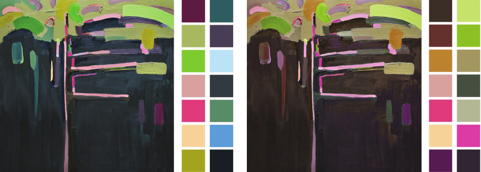
Ilustracja numer 1 przedstawia kompozycję malar-
ską zbudowaną według zasady współistnienia w obrę-
bie pracy kolorów ciepłych i zimnych. Po prawej stronie
4
Mam na myśli przede wszystkim zabudowę Śródmieścia War-
szawy.
5
Ich dobrym przykładem jest biurowiec popularnie zwany „zebrą”
przy ul. Mokotowskiej w Warszawie (proj. M. Tröthan, P. Bujnowski),
w którym połączenie czerni, koloru szkła oraz ryzykownego, choć świet-
nie dobranego złota (a więc od strony temperaturowej: barwy neutralnej,
chłodnej i ciepłej) tworzy charakterystyczną dla prac Kandinskiego i po-
ruszaną w jego tekstach mozaikę temperaturową.
sities described by Kandinsky as the key to nding har-
mony by complementing each other have disappeared and
no longer serve as a guide on how to combine colors, so
as not only to create an interesting object, but also not to
fall into repetitive monotony. In order not to be misunder-
stood that my intention is to focus on projects with bold
5
colors only, I will limit myself to giving the example of
an oce building designed by architect Helmut Jahn at
Twarda Street in Warsaw. Simple in form, slender build-
ing, apart from a clear accent in the lower, inconspicuous
part, seems to be another implementation that is “safe” in
terms of colors in the city center. However, if you look at
it more closely, you will notice that the color combina-
tions used in the main part of the building, which briey
speaking are limited to three colors, are not accidental.
The glass surface dominates, mostly cool, but – which
is most important – changing its color, saturation and
brightness with the changing weather and the point from
which it is perceived. The elements which seem black to
a viewer from the pavement level dominate between the
glass panes. It is important because black is temperature
neutral and in this case, in the composition of the building,
it plays the role of a color frame for the variable glass sur-
face. The whole is complemented by elements with a dis-
tinctly warm, brownish-yellow color dominated by black.
This supplement, seemingly insignicant, seems to play
a key role. The glass panes used usually have a cold tint.
Black, neutral elements hold everything together, but in
terms of temperature they are too close to the cold. Inserts
with a distinctly warm temperament close the relations
between the façade elements of the building, emphasizing
the dierences in their temperature. It is an example of the
building where you can see the conscious use of colors,
their temperatures, saturation and the relationships that
arise between them.
Composition
Translating the above observations into a plastic form
that is not representative, and therefore abstract, in order
to avoid any concrete associations with the shape char-
acteristic of the building and to limit myself only to the
analysis of color relations in the proposed composition,
I will give here examples of the same work with the use of
dierent color solutions mentioned in the text.
Figure 1 presents a painting composition created ac-
cording to the principle of coexistence of warm and cold
colors within the work. On the right, there are samples
of the most important colors used in the composition,
grouped into warm and cold ones.
The same composition, limited to warm colors, is
shown in Figure 2. If we create a set of colors with a similar
temperature, in this case warm colors, a
phenomenon of
5
A good example of them is the oce building popularly known
as “zebra” located at Mokotowska Street in Warsaw (arch. M. Tröthan,
P. Buj nowski), in which the combination of black, the color of glass and
the risky, though well-matched gold (i.e. analyzing the temperature side:
neutral, cool and warm colors) creates a temperature mosaic characteris-
tic of Kandinsky’s works and a temperature mosaic discussed in his texts.
20 Radosław Balcerzak
their relativity occurs. For example, a light red color when
combined with a dark red color seems to be lighter than
when viewed as a single spot on a bright surface. The
same process occurs with the temperature of individual
colors. A color with a slightly warm character cools down
when it is in the vicinity of a clearly warm color. Some-
times it takes on the role of a cool spot. This mechanism
can be seen especially in the temperature dierence be-
tween samples on the right-hand side of the illustration
and the color spots from the compositions, the samples
of which are accurately reected. Apart from a dierent
order of presentation than in the painting, we can see the
samples surrounded by a white background. In the illus-
tration, individual colors are directly adjacent to each oth-
er, having a more pronounced inuence on each other. As
a result, some of the stains in the composition seem to be
cooler than colors in the form of samples. This is one of
the reasons for this work to maintain harmony. The sec-
ond reason is the fact that we perceive warm colors as
more graceful in a composition and more self-sucient
than cold colors.
In Figure 3, the work is composed of cool stains. Due
to the relativity of colors and temperatures present also
here, some of the colors take on a slightly warm char-
acter. As a whole, however, we are dealing with a cool
composition and in many places even cold. The observed
relativity, which is a specic form of self-defense of col-
or compositions in combinations with scarce temperature
dierences, saves to some extent the reception of the work
as a whole. However, it clearly lacks even a line, which is
a temperature complement.
Another version (Fig. 4) shows what happens to the
colors of the composition under discussion, when we add
a reduction of the contrast between the stains which make
up the work to cool it down. So, we are dealing with a re-
duction of the impact of another element inuencing the
color relationships in the composition. Apart from tem-
perature, we also lose variability in saturation between
individual spots. The brightness scale is also reduced,
umieszczone są próbki najistotniejszych kolorów z kom-
pozycji pogrupowane na ciepłe i zimne.
Ta sama kompozycja ograniczona do barw ciepłych
została przedstawiona na ilustracji 2. W sytuacji gdy two-
rzymy zbiór kolorów o podobnej temperaturze, w tym
przypadku ciepłych, dochodzi do zjawiska ich względ-
ności, relatywności. Dla przykładu, kolor jasnoczerwo-
ny zestawiony z kolorem ciemnoczerwonym zdaje się
jaśniejszy niż oglądany jako pojedyncza plama na jasnej
powierzchni. Ten sam proces zachodzi z temperaturami
poszczególnych barw. Kolor o delikatnie ciepłym charak-
terze, w momencie gdy znajdzie się w sąsiedztwie koloru
wyraźnie ciepłego, schładza się. Przejmuje czasem rolę
plamy chłodnej. Mechanizm ten widać szczególnie w róż-
nicy temperatur pomiędzy próbkami znajdującymi się po
prawej stronie ilustracji a plamami kolorów z kompozy-
cji, których próbki są dokładnymi odzwierciedleniami.
Oprócz innej niż w obrazie kolejności zaprezentowania,
próbki widzimy otoczone bielą podkładu. Na ilustracji
natomiast poszczególne kolory graniczą ze sobą bezpo-
średnio, mając na siebie wyraźniejszy wpływ. W rezul-
tacie część plam z kompozycji zdaje się chłodniejsza niż
w formie próbek. Jest to jeden z powodów utrzymania
przez omawianą pracę harmonii. Drugim powodem jest
odbieranie przez nas kolorów ciepłych jako zgrabniej-
szych w kompozycji i bardziej samowystarczalnych ani-
żeli barw chłodnych.
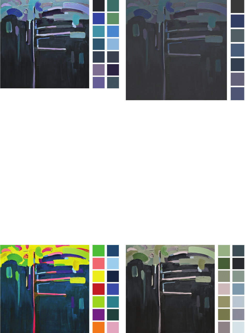
Na ilustracji 3 praca zbudowana jest z plam chłodnych.
Dzięki zachodzącej również tutaj relatywności kolorów
i temperatur część barw przyjmuje delikatnie ciepły cha-
rakter. Całościowo jednak mamy do czynienia z kompo-
zycją chłodną, a w wielu miejscach wręcz zimną. Zaobser-
wowana relatywność, będąca swoistą formą samoobrony
kompozycji barwnych w skąpych w różnice temperaturo-
we zestawieniach, ratuje w pewnym stopniu odbiór cało-
ści pracy. Wyraźnie jednak brakuje w niej choćby kreski,
będącej temperaturowym dopełnieniem.
Kolejna wersja (il. 4) ukazuje, co się dzieje z kolora-
mi omawianej kompozycji, gdy do jej schłodzenia do-
Il. 1. Kompozycja oryginalna
(autor: J. Balcerzak)
Fig. 1. Original composition
(author: J. Balcerzak)
Il. 2. Kompozycja zbudowana z kolorów ciepłych
(autor: J. Balcerzak)
Fig. 2. A composition made of warm colors
(author: J. Balcerzak)
Kolory przeciwstawne w teorii barw W. Kandinskiego / Contrasting colors in W. Kandinsky’s theory of colors 21
although to a lesser extent. As a result, we get a composi-
tion with clear color deciencies, which can of course be
a response in order to emphasize a specic, sensually ex-
pected goal. Apart from this purpose, such a color propos-
al does not seem to be an interesting solution that would
bring a positive element to the environment.
Increasing the contrast and saturation while maintain-
ing temperature diversity (Fig. 5) denitely changes the
appearance and reception of the above-mentioned com-
position. The work becomes energetic and entertaining.
However, the most important thing is that due to the con-
sistent increase in saturation – the derivative of which,
taking into account the colors used in the initial composi-
tion, is also the increase in the contrast between individual
damy również zmniejszenie kontrastu pomiędzy plama-
mi składającymi się na pracę. Mamy więc do czynienia
ze zmniejszeniem oddziaływania kolejnego elementu
wpływającego na relacje barwne w kompozycji. Oprócz
temperatury tracimy również różnorodność w nasyceniu
pomiędzy poszczególnymi plamami. Zmniejszona zosta-
je też, choć w mniejszym stopniu, skala jasności. W re-
zultacie otrzymujemy kompozycję o wyraźnych brakach
barwnych, mogącą być oczywiście odpowiedzią na pod-
kreślenie specycznego, oczekiwanego wrażeniowo celu.
Poza takim przeznaczeniem, tak zbudowana propozycja
barwna nie wydaje się rozwiązaniem interesującym, wno-
szącym dodatni pierwiastek do otoczenia.
Zwiększenie kontrastu i nasycenia przy równoczesnym
zachowaniu różnorodności temperaturowej (il. 5) zdecy-
dowanie zmienia wygląd oraz odbiór przytaczanej kom-
Il. 3. Kompozycja zbudowana z kolorów zimnych
(autor: J. Balcerzak)
Fig. 3. A composition made of cold colors
(author: J. Balcerzak)
Il. 5. Kompozycja zbudowana z kolorów zimnych i ciepłych
o zwiększonym kontraście i nasyceniu
(autor: J. Balcerzak)
Fig. 5. A composition made of cold and warm colors
with increased contrast and saturation
(author: J. Balcerzak)
Il. 6. Kompozycja zbudowana z kolorów zimnych i ciepłych
o zmniejszonym nasyceniu i kontraście
(autor: J. Balcerzak)
Fig. 6. A composition made of cold and warm colors
with reduced saturation and contrast
(author: J. Balcerzak)
Il. 4. Kompozycja zbudowana z kolorów zimnych
o zmniejszonym kontraście (autor: J. Balcerzak)
Fig. 4. A composition made of cold colors with reduced contrast
(author: J. Balcerzak)
22 Radosław Balcerzak
color stains – and keeping the dierences in temperatures,
the composition does not disintegrate and gives the im-
pression of being uniform.
Figure 6 is an example of the search for harmony in
a composition with reduced saturation and contrast be-
tween color stains. To keep the chance of obtaining the
expected eect, the dierences in the temperature of indi-
vidual colors were maintained.
Conclusions
Summing up the issues raised in this article and the ef-
fects of artistic transformations of the selected composi-
tion and the conclusions resulting therefrom, we can risk
a thesis that one of the basic elements which makes it pos-
sible to compose a harmonious artistic composition, com-
plete in its character, the visual side of which is also the
eect of an architect’s work, is the conscious use of warm
and cold colors. The hints quoted in the text were given
by Kandinsky. He described pairs of opposite colors in
terms of temperature and demonstrated the relationships
between yellow and blue in the foreground.
Translated by
Jadwiga AndrejczukPanasiuk
pozycji. Praca staje się energiczna i zajmująca. Najważ-
niejsze jednak, że dzięki konsekwentnemu zwiększeniu
nasycenia – czego pochodną, biorąc pod uwagę zastoso-
wane barwy w kompozycji wyjściowej, jest również pod-
niesienie kontrastu pomiędzy poszczególnymi plamami
barw – oraz pozostawieniu różnic w temperaturach kom-
pozycja nie rozsypuje się i daje wrażenie jednolitej.
Ilustracja 6 jest przykładem poszukiwań harmonii
w kompozycji przy zmniejszonym nasyceniu i kontraście
pomiędzy plamami barw. Dla zachowania szansy na uzy-
skanie oczekiwanego efektu utrzymano różnice w tempe-
raturach poszczególnych kolorów.
Wnioski
Podsumowując poruszone zagadnienia oraz efekty pla-
stycznych przeobrażeń wybranej kompozycji i wynikają-
ce z nich wnioski, można pokusić się o tezę, że jednym
z podstawowych elementów umożliwiających skompo-
nowanie harmonijnej, pełnej w charakterze kompozycji
plastycznej, której wizualną stroną jest również efekt
pracy architekta, jest świadome stosowanie barw ciepłych
i zimnych. Wskazówki przytoczone w tekście zostawił
Kandinsky, opisując pary barw przeciwstawnych, pod
względem temperaturowym na pierwszy plan wysuwając
relacje między żółcią i błękitem.
Bibliografia /References
[1] Kandinsky W., O duchowości w sztuce, Państwowa Galeria Sztuki
w Łodzi, Łódź 1996.
[2] Kandinsky W., Punkt i linia a płaszczyzna. Przyczynek do analizy
elementów malarskich, PIW, Warszawa 1986.
[3] Itten J., Sztuka barwy, d2d.pl, Kraków 2015.
[4] Albers J., Interaction of colours, Yale University Press, London
2013.
[5] Kwiatkowska-Lubańska A., Kolorowa strona Bauhausu, „Formy”
2019, nr 3, 2–18.
[6] Gropius W., Pełnia architektury, Karakter, Kraków 2014.
[7] Kościelecki S., Współczesna koncepcja wychowania plastycznego,
PWN, Warszawa 1977.
[8] Dzikowska E., Artyści mówią, Rosikon Press, Izabelin–Warszawa
2011.
Streszczenie
Celem artykułu jest zwrócenie uwagi na potrzebę umiejętnego posługiwania się kolorem w architekturze. W olbrzymim skrócie na podstawie opra-
cowania W. Kandinskiego O duchowości w sztuce przedstawiono, jak do tematu koloru podchodzono w Bauhausie. Następnie, posługując się abs-
trakcyjną kompozycją malarską, nieprzedstawiającą konkretnych kształtów ani tematów, poddając ją zabiegom zmieniającym zachodzące w niej
relacje barwne, podjęto próbę sprawdzenia i potwierdzenia myśli sformułowanych przez Kandinskiego. Prezentowane ilustracje oraz przynależne im
komentarze w intencji autora przybliżyć mają omawiane zagadnienie czytelnie oraz w miarę możliwości w obiektywnym stopniu, z ukierunkowa-
niem na stosowanie koloru w architekturze współczesnej.
Słowa kluczowe: Bauhaus, architektura, kolor
Abstract
The aim of the article is to draw attention to the need for skillful use of color in architecture. On the basis of W. Kandinski’s study Concerning the
Spiritual in Art , the Bauhaus approach to color was briey presented. Then, using an abstract painting composition which did not represent specic
shapes or themes and subjecting it to changes of the color relations, an attempt was made to verify and conrm the thoughts formulated by Kandinsky.
It was the author’s intention that the presented illustrations and the accompanying comments should present the issues under discussion clearly and,
if possible, objectively, with a focus on the use of color in contemporary architecture.
Key words: Bauhaus, architecture, color