138 Jadwiga Urbanik
concept even during the execution phase. The façades of
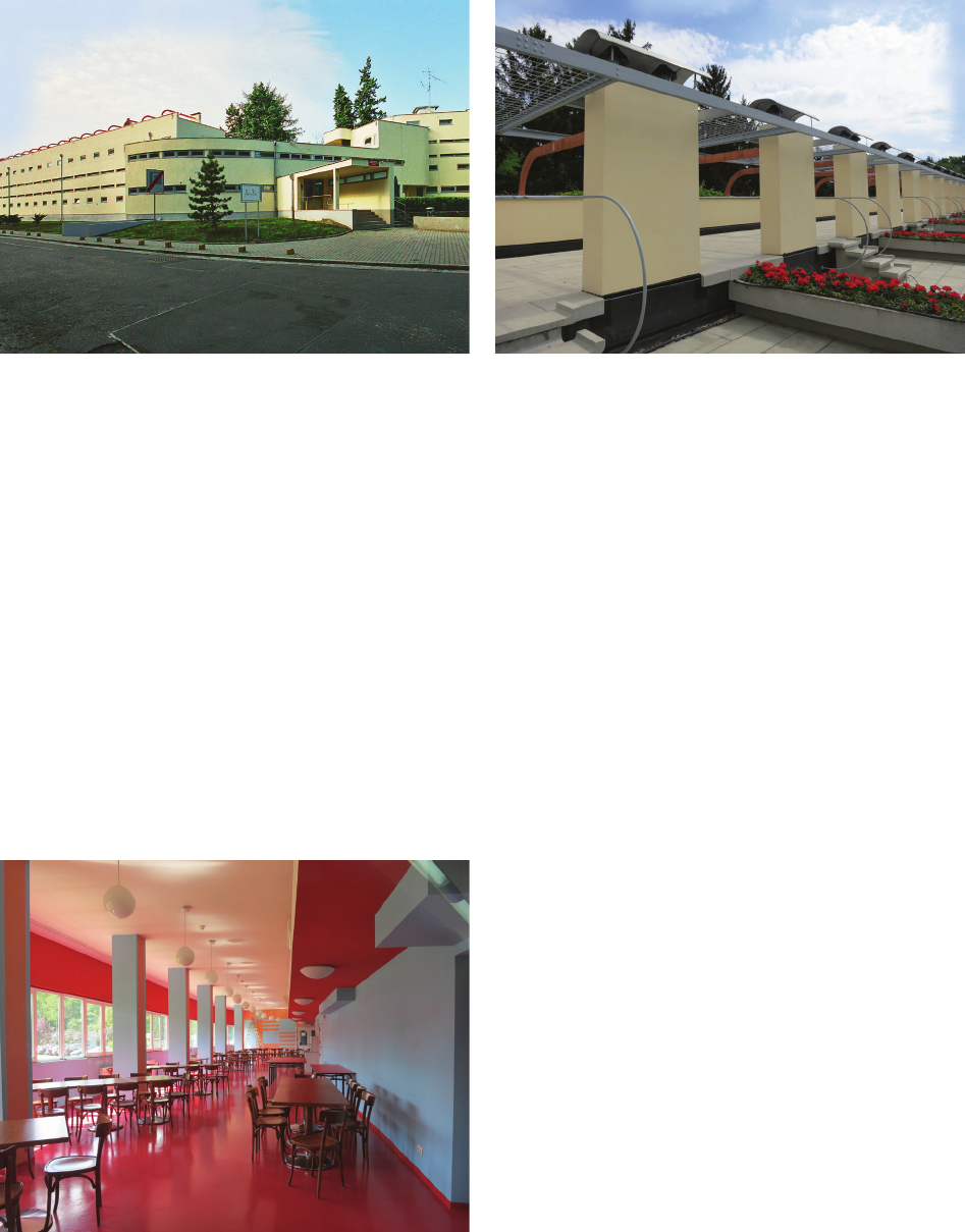
the Ledigenheim building were painted in ochre light (“lu-
minous”) color (Fig. 11). All elements of railings, external
balustrades, window, and door frames were painted in grey
(“mouse grey”). Only the balcony doors of the right wing of
the building were in the color of the elevation – light grey.
The reinforced concrete structure of the trellis on the roof
of the left wing was orange-red concrete (Fig. 12), while
the elements of the building foundation and the retaining
walls were left in their natural color (concrete color).
The general use interiors (lobby and restaurant) fea-
tured strong and vibrant colors. The lobby was a deep blue
color, against which shiny armchairs made of steel pipes
cast silver reections, while the restaurant was dominated
by many shades of red [39, p. 410]. In the saturated colors
of the lobby and restaurant of Hans Scharoun’s house and
in the way they were combined, the spirit of expression-
ism can be sensed. The use of intense colors and simple
geometric patterns (blue and pink stripes on the gable wall
of the restaurant, a blue stripe repeating the shape of the
room on the ceiling of the lobby) is close both to the ex-
pressive shaping of space and to the color tendencies of
the late twenties associated with the German campaign for
color in the city (Fig. 13).
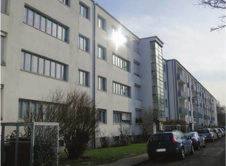
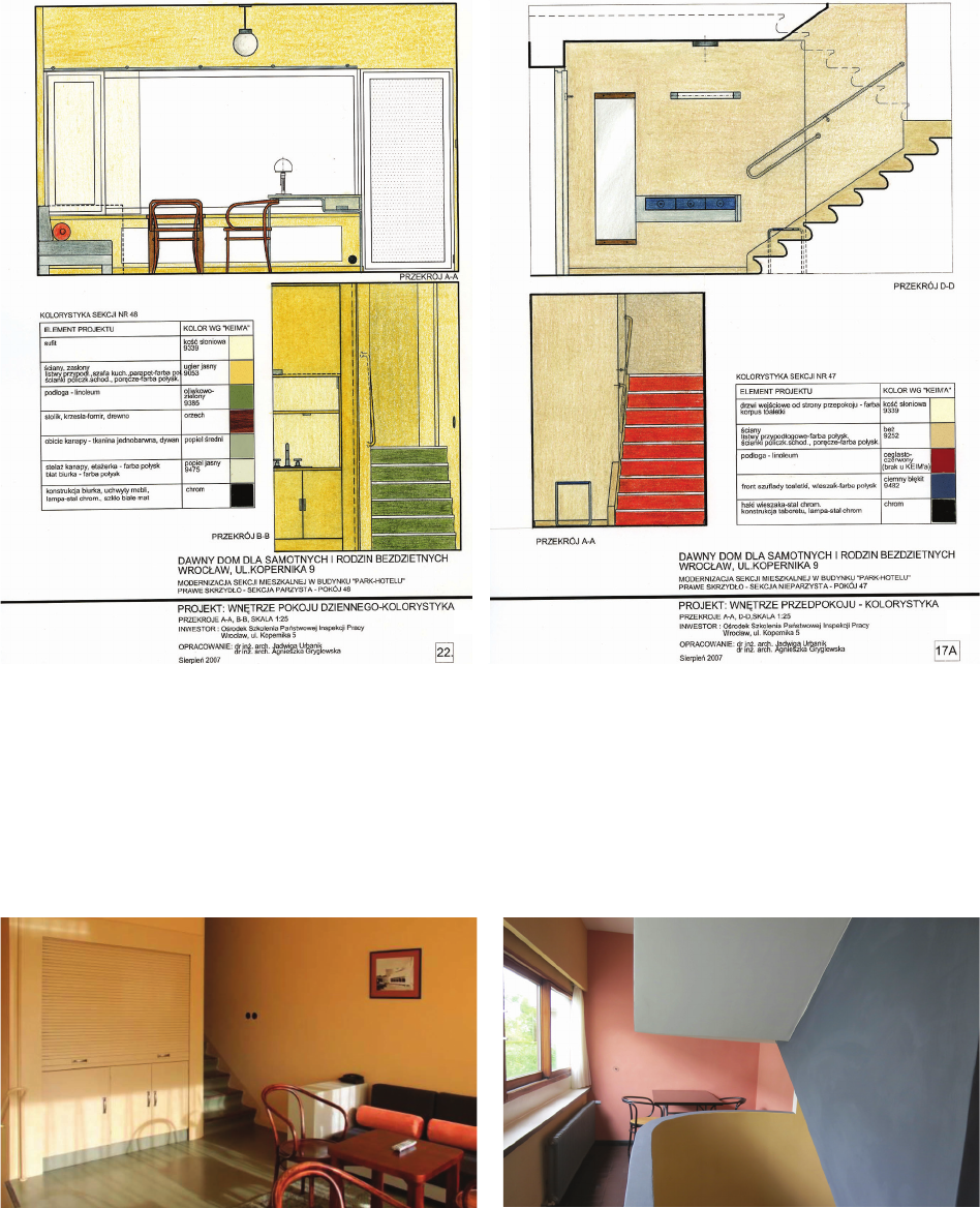
In the residential sections, Scharoun proposed two
color versions in pastel tones (ivory, light ochre, olive
green, ash or ivory, beige, brick red, ash in the right wing
sections), enhanced by wooden or chrome-plated furnish-
ings [27] (Figs. 14, 15).
Hans Scharoun’s house for singles was one of the pro-
jects included in the 1925–1930 nationwide campaign of
the “colorful city” (Die farbige Stadt). In Breslau Hans
Scharoun, Theo Eenberger, Moritz Hadda (architects
of the WuWA exhibition housing estate), and Hermann
Wahlich functioned as heads of departments of the Build-
ing Police responsible for the city’s color scheme [33].
2
nd
half of 1920s was a period of a real “cry for color”,
still originating in expressionism, for which color was
also a means of architectural expression. More than one
million buildings in Germany at that time received a new
coat of color.
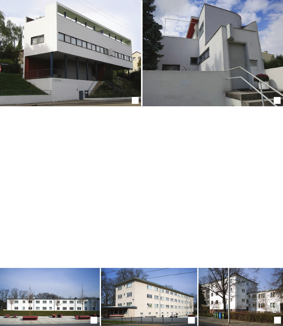
It is interesting that the color scheme of the interior of
Le Corbusier’s semi-detached house from the Weissen-
hof estate is almost identical to Scharoun’s proposal from
Wrocław. Although these architects shared a completely
dierent approach to shaping architectural form, their
taste for color was similar. Le Corbusier’s house, white
on the outside, presents a real “cosmos of colors” on the
inside. The colors were saturated, yet fractured, so char-
acteristic of the mineral pigments that were used at the
time (Fig. 16).
Summary
The examples described above show that regardless of
whether they are model houses in the Werkbund housing
estates or houses built as part of the city construction pro-
gram, their colors fall within the trends of “white architec-
ture” or of the “colorful city”. The color scheme clearly
reected the very individual tastes of its architects.
Today, knowledge of the color scheme is essential to
the proper revalorization of interwar architecture, thus
portraying original character is the duty of both historians
and conservators.
Translated by
Jan Urbanik,
proofreading by Katarzyna Jaroch
References
[1] Brenne W., Creating a cosmos of colours. Bruno Taut’s housing
estates in Berlin, [in:] M. Kuipers, E. Claessens, M. Polman, L. Ver-
poest (eds.), Modern Colour Technology. Ideals and Conservation,
Tripiti, Rotterdam 2002, 22–25.
[2] Werkbund Ausstellung “Die Wohnung” 1927, Der Ausstellung-
leitung (Hrsg.), Industrie Verlags- und Druckerei i Werbehilfe,
Stuttgart 1927.
[3] Výstava moderního bydlení Nový Dům Brno 1928, Z. Rossmann,
B. Václavek (red.), Brno 1928.
[4] Werkbund Ausstellung. Wohnung und Werkraum. Breslau 1929. 15.
Juni bis 15. September. Ausstellungs Führer, Ausstellungsleitung
(Hrsg.), Breslau 1929.
[5] Výstava bydlení – stavba osady Baba Praha 1932, P. Janák, L. Sut-
nar (red.), Svaz československého díla, Praha 1932.
[6] Die internationale Werkbundsiedlung Wien 1932, J. Frank (Hrsg.),
Anton Schroll & Co, Wien 1932.
[7] Joedicke J., Weissenhof Siedlung Stuttgart, Karl Krämer Verlag,
Stuttgart 1989.
[8] Kirsch K., Die Weißenhofsiedlung, Deutsche Verlags-Anstalt, Stutt -
gart 1999.
[9] Marbach U., Rüegg A., Werkbundsiedlung Neubühl in Zürich-
Wollish ofen 1928–1932, Ihre Entstehung und Erneuerung, Doku-
mente zur Schweizer Architektur, GTA Verlag, Zürich 1990.
[10] Šlapeta V., Urlich P., Křížková A., Great Villas of Prague 6, Baba
Housing Estate 1932–1936, Foibos, Praha 2013.
[11] Urbanik J., WUWA 1929–2019. Wrocławska wystawa Werkbundu,
Muzeum Architektury, Wrocław 2019.
[12] Šenberger T., Šlapeta V., Urlich P., Osada Baba. Plány a modely /
Baba Housing Estate. Plans and Models, Czech Technical Univer-
sity in Prague, Faculty of Architecture, Prague 2000.
[13] Werkbundsiedlung Wien 1932. Ein Manifest des Neuen Wohnens,
A. Nierhaus, E.M. Orosz (Hrsg.), Müry Salzmann Verlags, Wien
2012.
[14] A Way to Modernity. The Werkbund Estates 1927–1932, J. Urbanik
(ed.), Muzeum Architektury, Wrocław 2016.
[15] Brenne W., Bruno Taut. Meister des farbigen Bauens in Berlin,
Verlagshaus Braun, Berlin 2005.
[16] Brenne W., Farbe bei Fassaden des Neues Bauens und der Mo -
der ne, [in:] K. Guttmejer (red.), Kolorystyka zabytkowych elewacji
od średniowiecza do współczesności. Historia i konserwacja, Kra-
jowy Ośrodek Badań i Dokumentacji Zabytków, Warszawa 2010,
225–244.
[17] De Jonge W., Colour and Modern Movement architecture, [in:]
M. Kuipers, E. Claessens, M. Polman, L. Verpoest (eds.), Modern
Colour Technology. Ideals and Conservation, Tripiti, Rotterdam
2002, 8–11.
[18] Hammer I., Lime Cannot be Substituted! Remarks on the History
of the Methods and Materials of Painting and Repairing Historical
Architectural Surfaces, [in:] K. Guttmejer (red.), Kolorystyka za-
bytkowych elewacji od średniowiecza do współczesności. Historia

